
Voter Information Association is a service to improve voter engagement and turnout.
it was created for design 361, user experience design.
the brief:
Create a system that distributes information to Washington State voters to help them make informed decisions. This system should be accessible to people both digitally and in person.
the team:
Julian Tennyson— Production, Video, Research, Usability Testing, Kiosk Development
Han Shaffer— Posters, Research, Usability Testing, Copywriting
Reese Murakami— Product Development, Prototyping, Script Research, Usability Testing
Bailey Lehtinen— Case Study, Research, Usability Testing, Production
Dallas Dyson— Web Development, Visual Style, Asset Development, Research
research
To create our service, we first needed to research the voting process itself.
We went about researching 3 separate facets of the voting process:
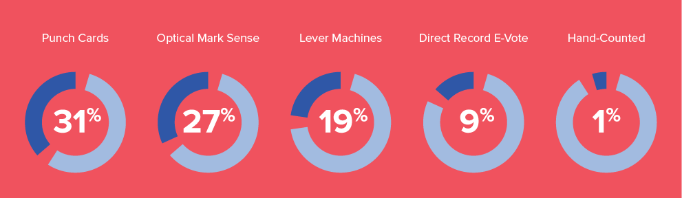
US Voting Systems
The five major ways the United States counts votes during elections:
US Voter's Guides
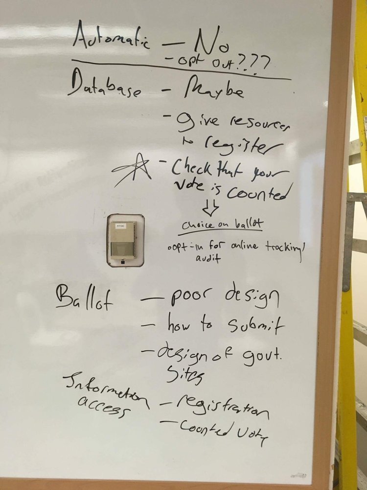
There are many points of tension on the current voter pamphlets where people can gain access to information about the measures and candidates, which we discovered through attempting to access information for what was, at the time, the current Washington State election. We found:
— Voters Pamphlets were between 140 and 250 pages on average
—Accessibility of pamphlets is not equal across precincts and copies for visually impaired voters is also varied
—The pamphlets are presented as "neutral" without any information presented about where the information was gathered from or by whom it was paid for.
Voting Processes in other nations
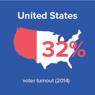
United States:
Ranked #139 out of 172 countries when it came to voter turnout for elections.
There are 13,000 election jurisdictions overseen by county and city officials, but there are not many commonalities between the jurisdictions.
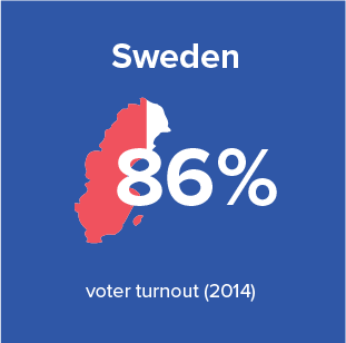
Sweden:
Automatic enrollment: maintain a national database that includes the name, address, place of birth, and marital status of each individual.
Electoral Authority then sends proof of registration to each eligible voter, which contains the address of the correct polling station and its hours.
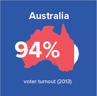
Australia:
Individuals fill out forms themselves and a centralized system maintains a national database.
Voting is compulsory and there is a $20 fine for those who fail to vote.
Encouragement to vote is very in-your-face with presence on citizenship forms, during school final exams, and whenever someone moves houses.
Insights
Diversifying methods of voting, when done right, can be an effective way to give voting access to more people.
Allowing voters to access information about registry, measures, and other voting related tasks leads to higher voter turn out when combined with the Australian idea of heavily encouraging people to vote.
The voter pamphlets are an issue that is unequal and unsustainable in such a large country. Initially we thought that standardization of forms should be the first step in solving this problem, but legal constraints made that nearly impossible.
Citizens in the United States experience a general lack of transparency during the process of voting resulting in a lack of trust in said process.
conceptualizing a solution
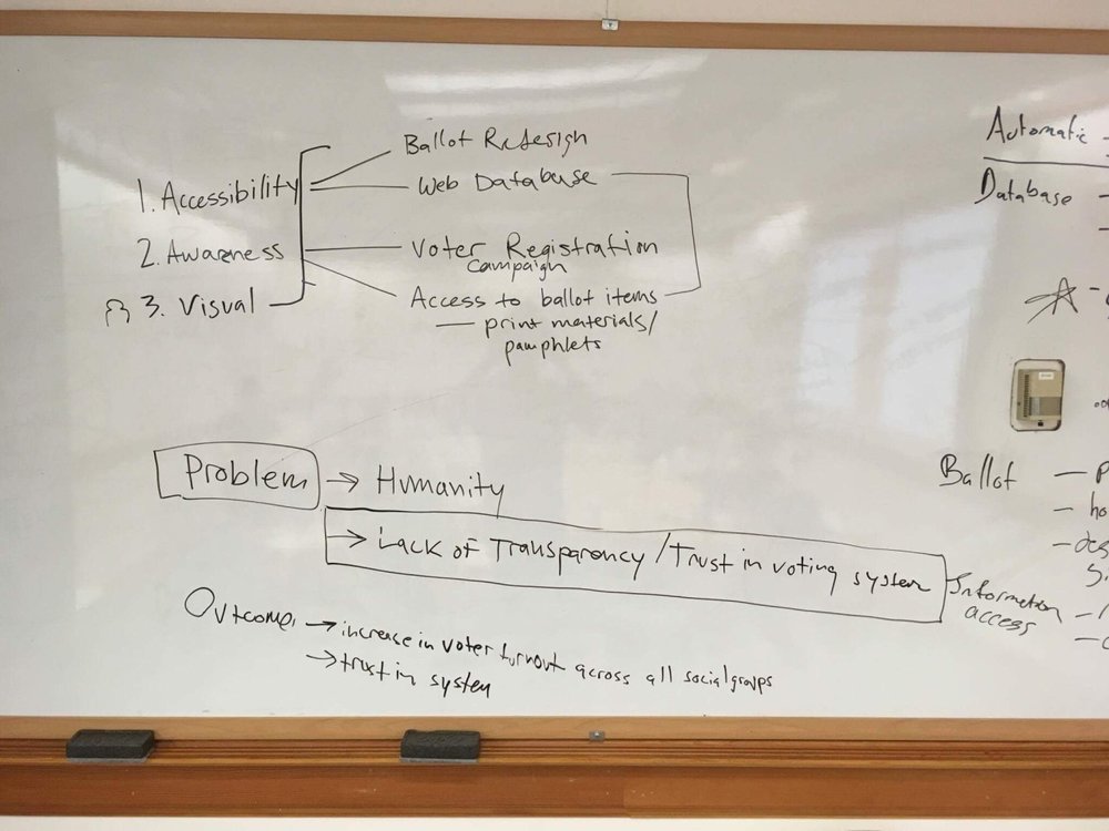
We spent a total of about 6 hours debating over how to solve the problem. This debate resulted in the development of a three part service,separate from the government and funded by publicly visible, bipartisan donors.
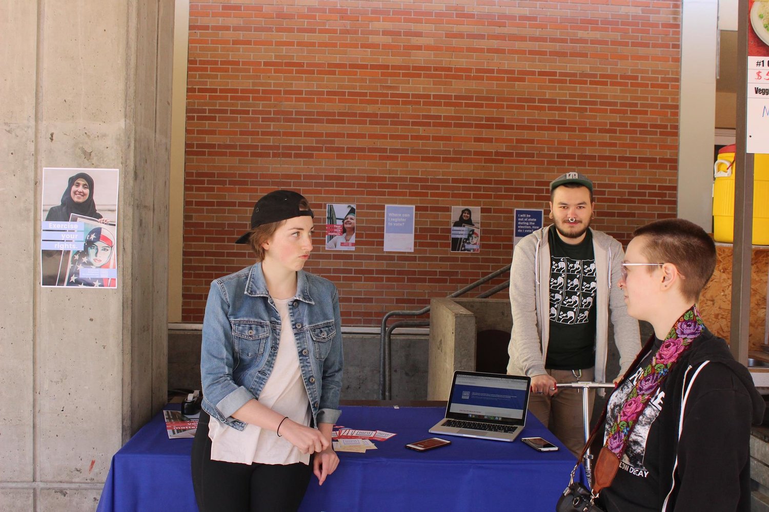
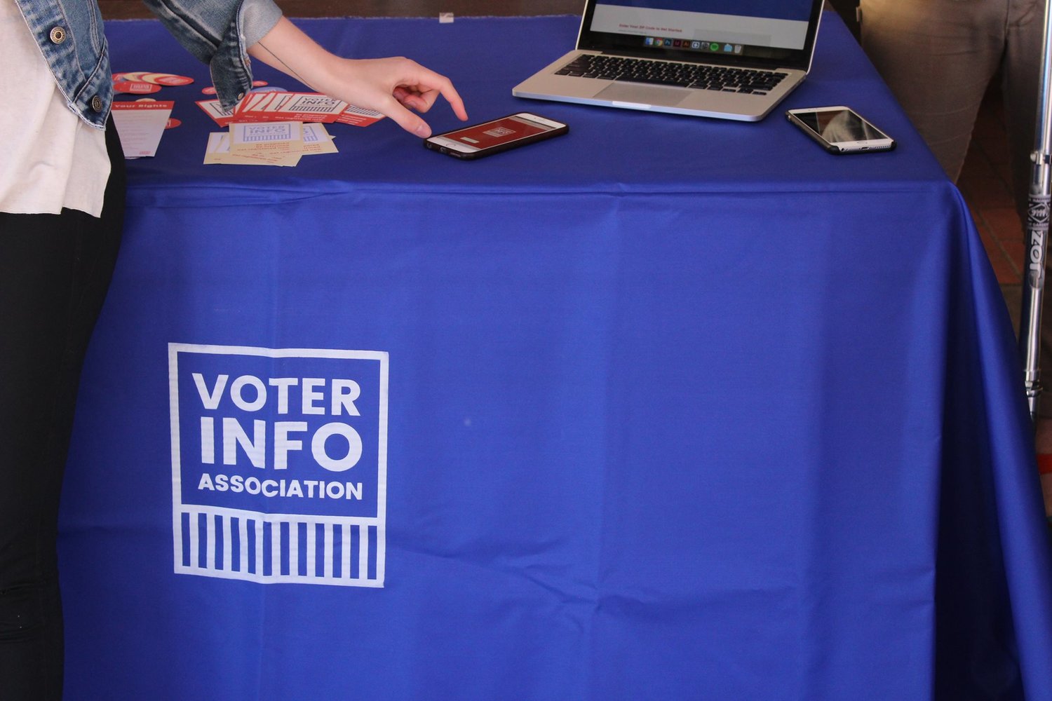
Part 1 — Kiosks
Pop up kiosks will be put up at various high traffic locations during election season. These kiosks will also be put in areas where users may not have easy internet access (i.e. homeless shelters, libraries, food banks). Volunteers/staff will answer questions and provide resources such as a bipartisan voter's pamphlet for the public.
Part 2 — Product/Web
The website and app we are creating will have similar functionality to the kiosks but in a way that is more effective for those that are digitally minded. The website and app will display partisan information about ballot measures, give people the option to fill out a ‘mock ballot’ and shows them the locations of ballot drop boxes in their area.
Part 3 — Campaign
A system of voter pamphlet information posters and general/election awareness campaign posters available at the kiosks and online. This campaign would be underway during election times and close to registration deadlines.
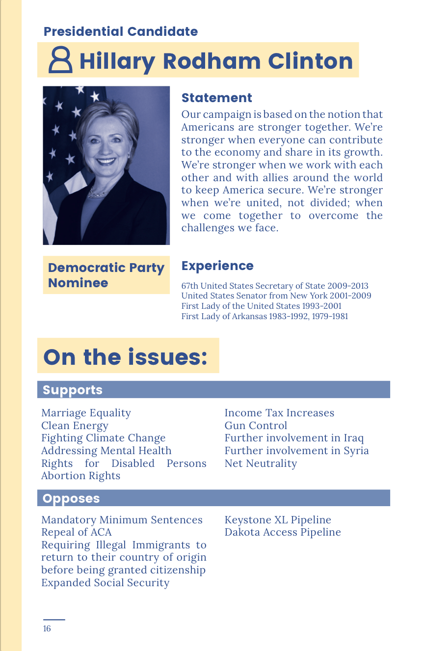
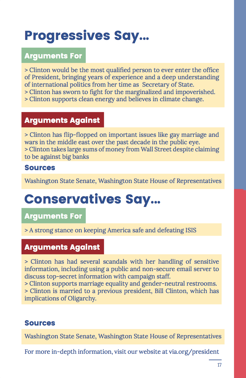
All information provided in the different components of our solution will be fact-checked and clearly cited. Measures will show information about how Progressives feel and how Conservatives feel about the measure. This allows us to bypass the complication of users needing to decipher information that appears to be nonpartisan. This task often leaves users feeling confused and skeptical. Clearly labeling information as partisan allows users to make decisions based on their own political leanings without the fear of receiving misleading information.
user testing
We focused our resources on testing the two main aspects of our service that would actually be in the hands of the user. While using the kiosks, the users will be guided by staff an volunteers, but the pamphlets and the app will be mostly used while the user is alone.
Pamphlets
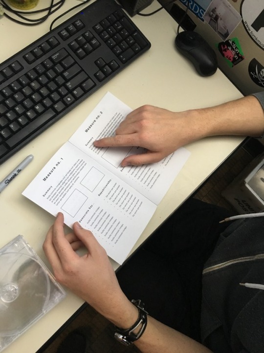
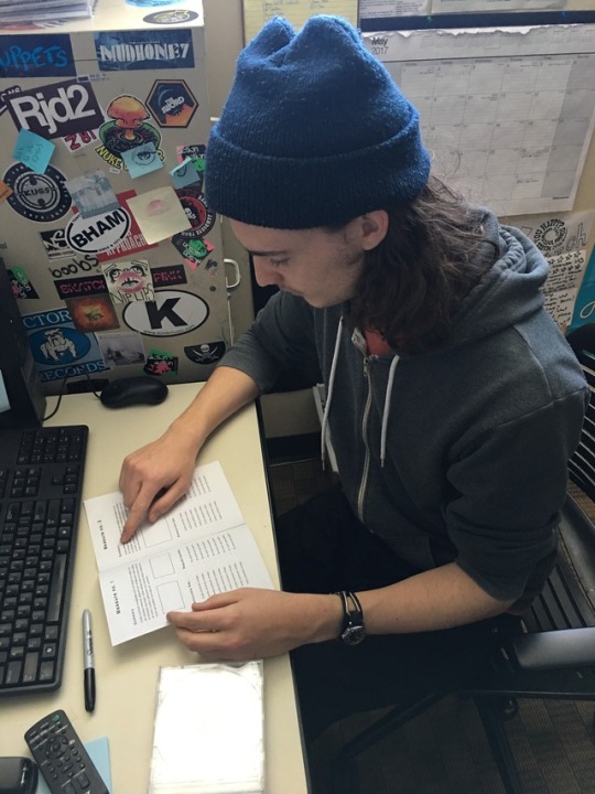
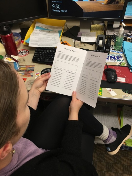
In testing the low fidelity version of our voter information pamphlet many of our users were confused as to what the information we were presenting to them was actually about. To solve this we implemented two major solutions:
Attendee Interaction Development
Ideally, the attendee at the VIA kiosk will walk through the pamphlet with the user. While this isn’t necessary and the pamphlet should function without an attendee, it’s important that we examine the attendee’s role. What are the attendees duties? What sort of advice can they offer? What potential do they have to sway the user’s opinion and how do we avoid this?
Higher Fidelity
We need to add some sort of pseudo data visualizations. Right now those elements are represented by empty boxes. More detailed visualizations will allow for clearer affordance of what those items are and what they represent. We also forgot to add yes or not check boxes to the bottom of each page, which really impeded some of our early rounds of testing. It could also be useful for us to provide the user with a description of what we are trying to accomplish through the pamphlet.
Product
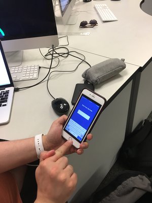
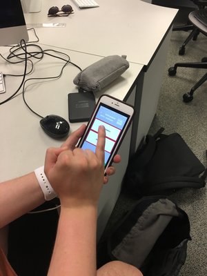
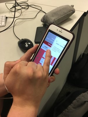
The voting process is tedious and developing an app that eases that, while also being easily navigable and maintaining the nuances of a ballot is no easy task. We implemented the following solutions to keep users from getting lost:
Affordances
More affordances that tell the user what to do next will help them to understand the virtual space that they are in when interacting with the app. This will come in the form of buttons with helpful phrases like ‘next step’ and icons that let the user know when they have completed one portion of the apps purpose.
Navigational Elements
Given that much of this app centers around filling out a ‘mock ballot,’ clear navigational elements are essential to let the user know where they are at. Navigational elements will also help the user to understand that they can access other pieces of information outside of filling out a mock ballot.
implementation
With our research and testing complete, we were ready to develop final prototypes for each facet of our service.
part 1 — kiosks & pamphlet
Purpose
To increase voter trust through human engagement and provide accessibility to those who may not be able to obtain information through other means.
Features
—In person contact
—Partisan sectioned information
—Informational print hand outs
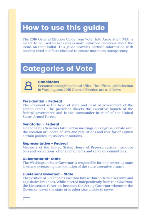
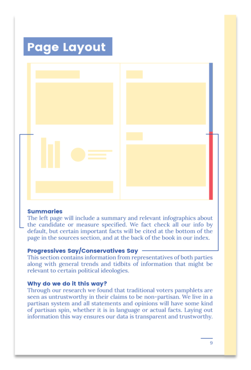
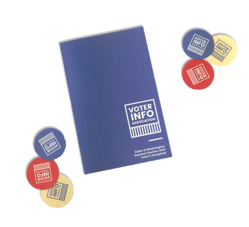
You can open the full .pdf of the prototype pamphlet Here.
part 2 — product
Purpose
To make information as accessible and convenient as possible for users who have internet access. This part of the system allows users to pause and return to their process at any time.
Features
— Mock ballot
— Searchable database of measures and candidates
— Ability to leave and come back mid process
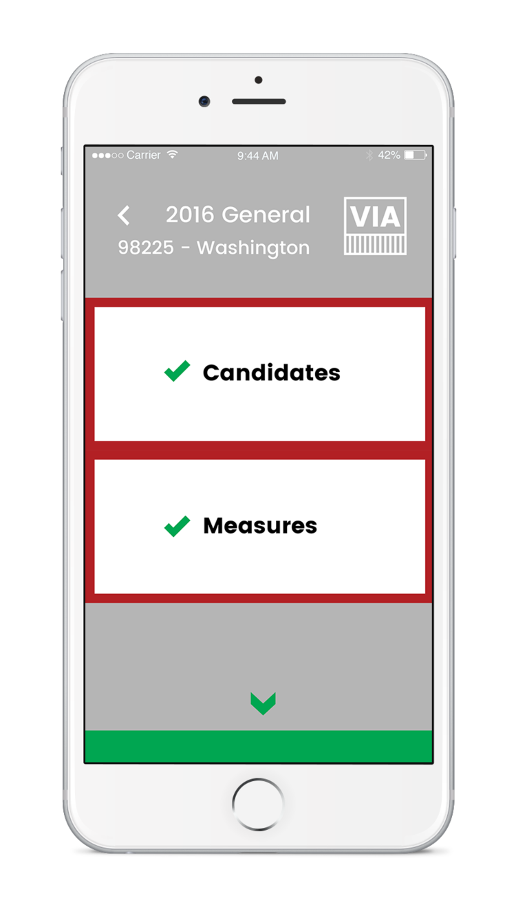
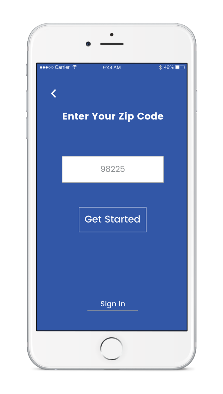
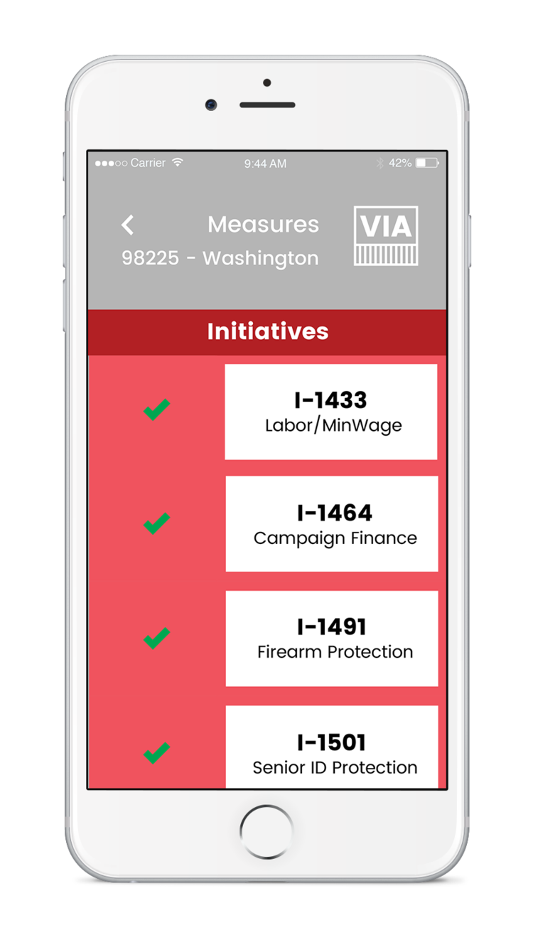
You can try out our prototype on adobe XD Here!
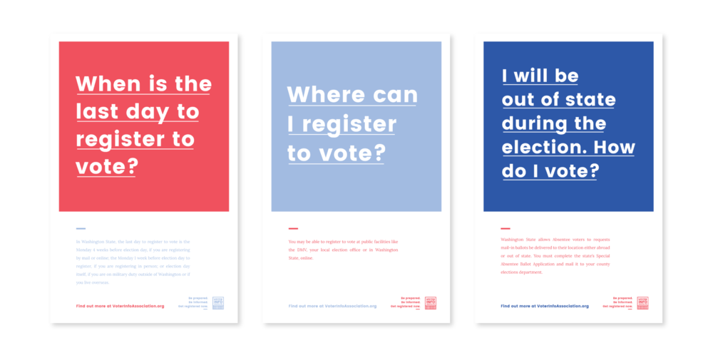
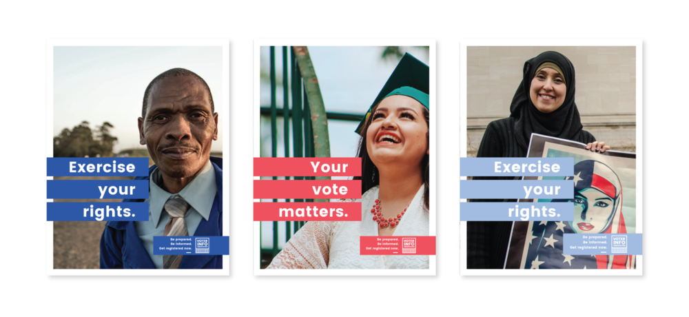
part 3 — campaign
Purpose
Increasing awareness through uncomplicated visuals in high traffic areas and ecouraging users to seek out other services VIA provides.
Features
— Information about VIA services
— Information about voting processes
—
Fully downloadable on the VIA website
what makes us different?
Our most valuable tool as designers is our ability to organize, contextualize and present information. We used that tool throughout every aspect of this product to not only increase voter awareness. but to give voters access to critical information that becoming increasingly more difficult to find. In addition to this, our system is actually feasible. It doesn't require any permissions from the state or change of laws, no large sum of money, just a few willing hands with enough drive to make it happen.
thank you for reading.
NEXT PROJECT