
Harvestr is an app for growing food.
It was created for design 361, user experience design.
the brief:
Research, design, develop, and test a mobile application prototype.
An app to teach people how to grow their own food whether it be in a large yard or in an apartment. The app allows users to input their information about experience level, type of space, and desired crop.
the team:
I collaborated with Han Shaffer to complete this project. The only things we split work on was the visual design - they made the style guide and I did layout of the app and motion elements. We worked cooperatively on research, conceptual development, user testing, journey maps, and this case study.
we discussed initial concepts and plans in class and came up with a very rough map of what our "loop" of functionality within the app would be.
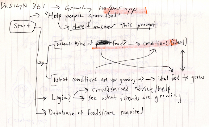
We decided we wanted the app to function in two ways. the first and more common path would involve the user entering information about their garden, and having plants suggested to them by category. The other path would be the inverse: the user searches for a plant and the app tells the user what conditions they will need to grow the plant. Our audience would be people who are app-savvy and anywhere from full beginners to experts at gardening.
with this idea in mind, we began by doing some competitor research.
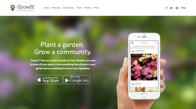
GrowIt is a social media based app for gardeners, allowing people to share what they are growing and possibly exchange plants with other users.
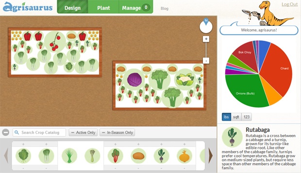
Agrisaurus is a web based app primarily for laying out a garden based on the amount of space each plant will take up. It has a very extensive database of information, which is something we wanted to have in our app.
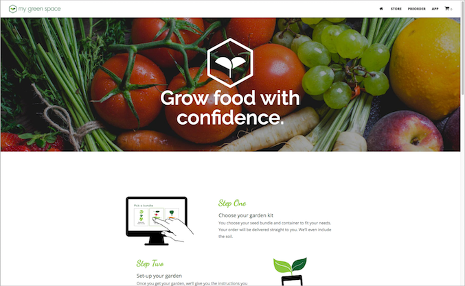
My Greenspace is the closest to the intention we were following for our app. The app has tutorials and lets users input information about their location, climate, and budget to maximize their ability to grow food. The app also integrates e-commerce, which we wanted to stay away from.
there were elements of each competitor that we wanted to emulate, and elements that could be improved upon.
the next step was conducting interviews with users to determine what kind of functionality our audience would want.
We interviewed Rose Delorie and Marlo Mudd and took notes.
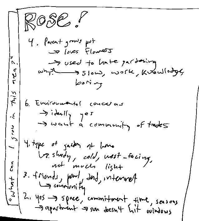
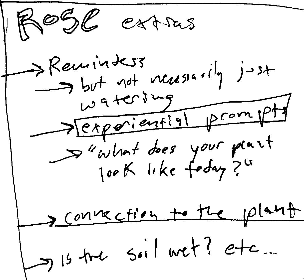
Our insights included:
- Reminders are easily tuned out unless they’re prompting the user to do something out of the ordinary
- Having a community within the app was intriguing
- People don’t necessarily grow their own food to be economical. Gardening is an investment.
- Jargon makes it difficult to learn how to garden
- Forgetting about a plant is the easiest way to kill it.
- Reminders should be experiential so as not to get dull/annoying
with this in mind, we moved into creating personas and user scenarios to imagine how our app might be used.
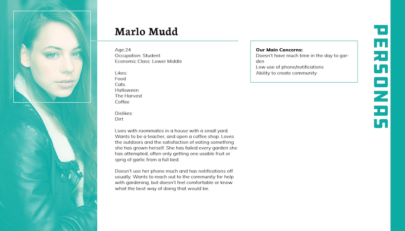
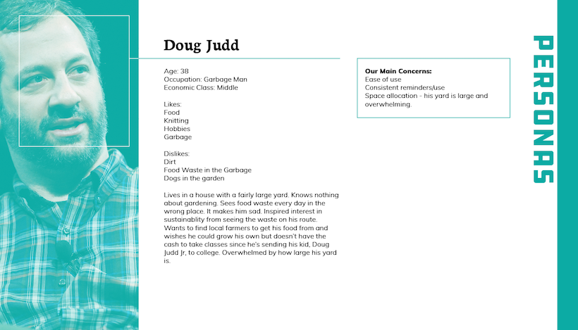
yes, that's a photo of judd apatow.
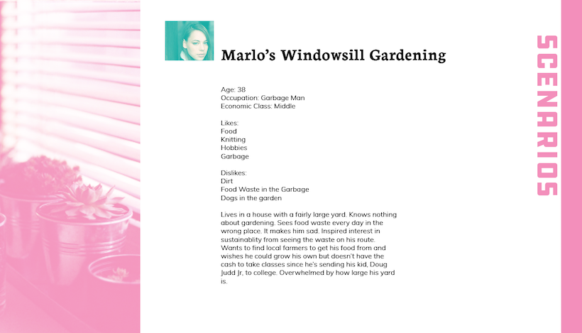
this gave us a rough concept for key features of our app, so we began sketching two journey maps.
the first was simply the process someone would go through for planting food, without assistance from an app.
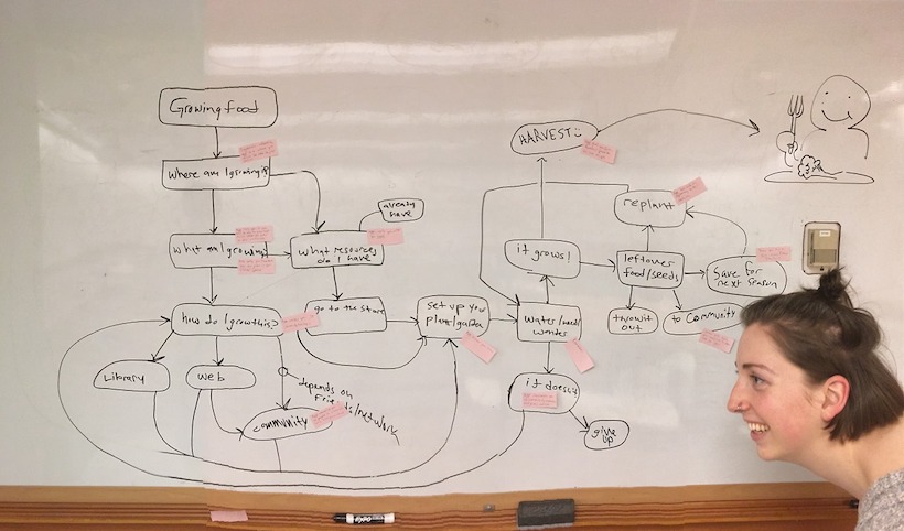
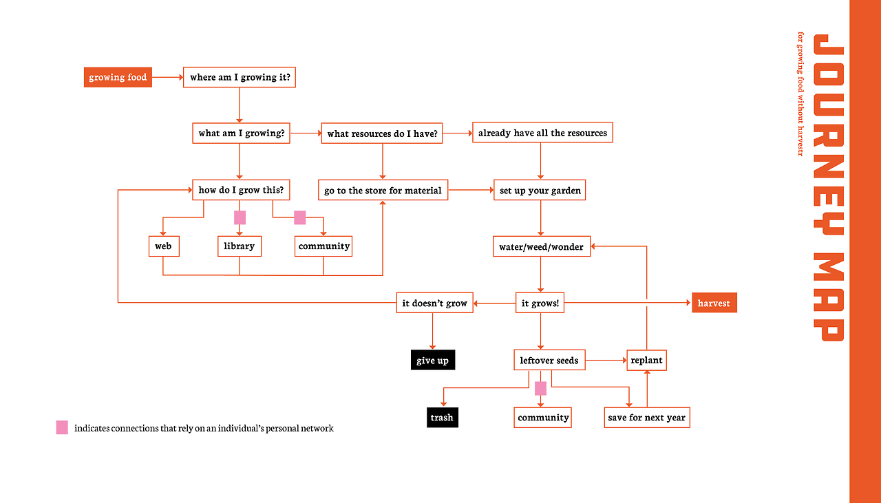
from this, we identified areas that our app could improve the process and pathways that could be avoided with the help of our app.
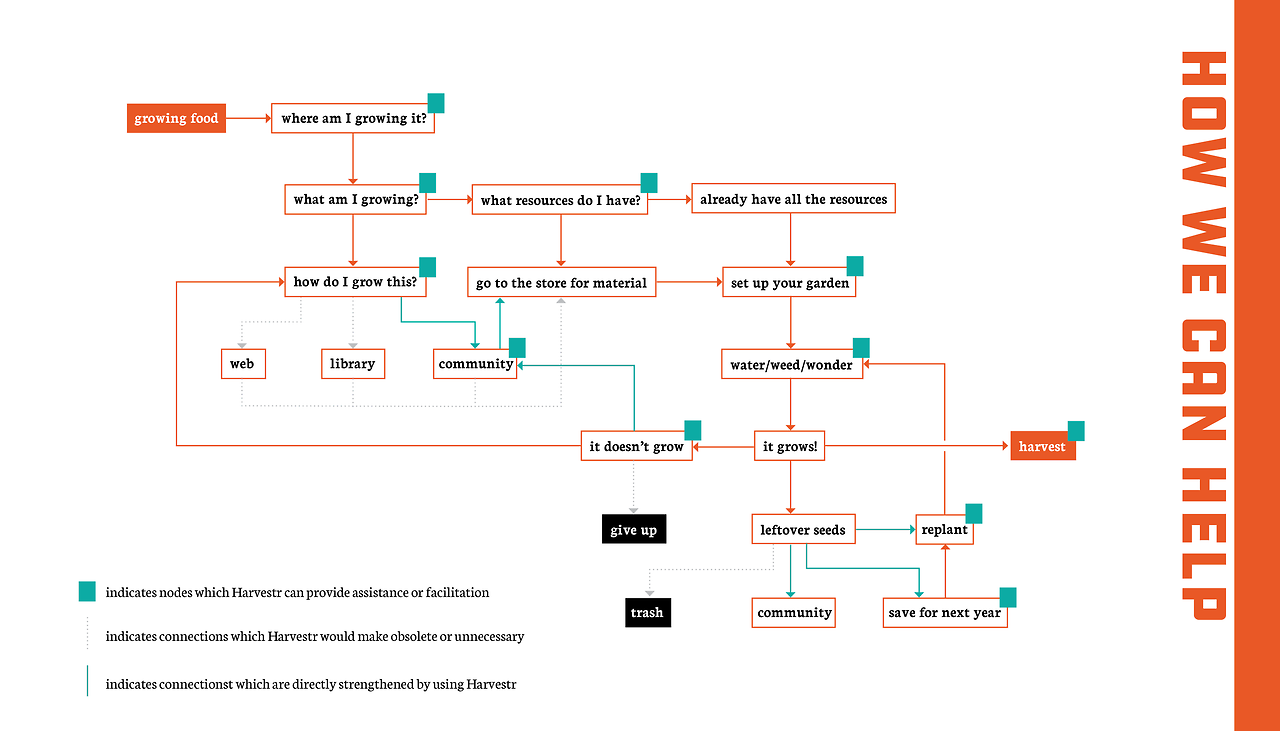
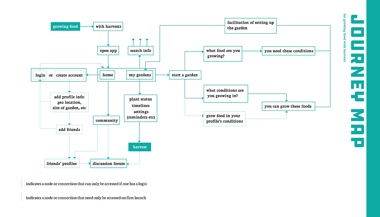
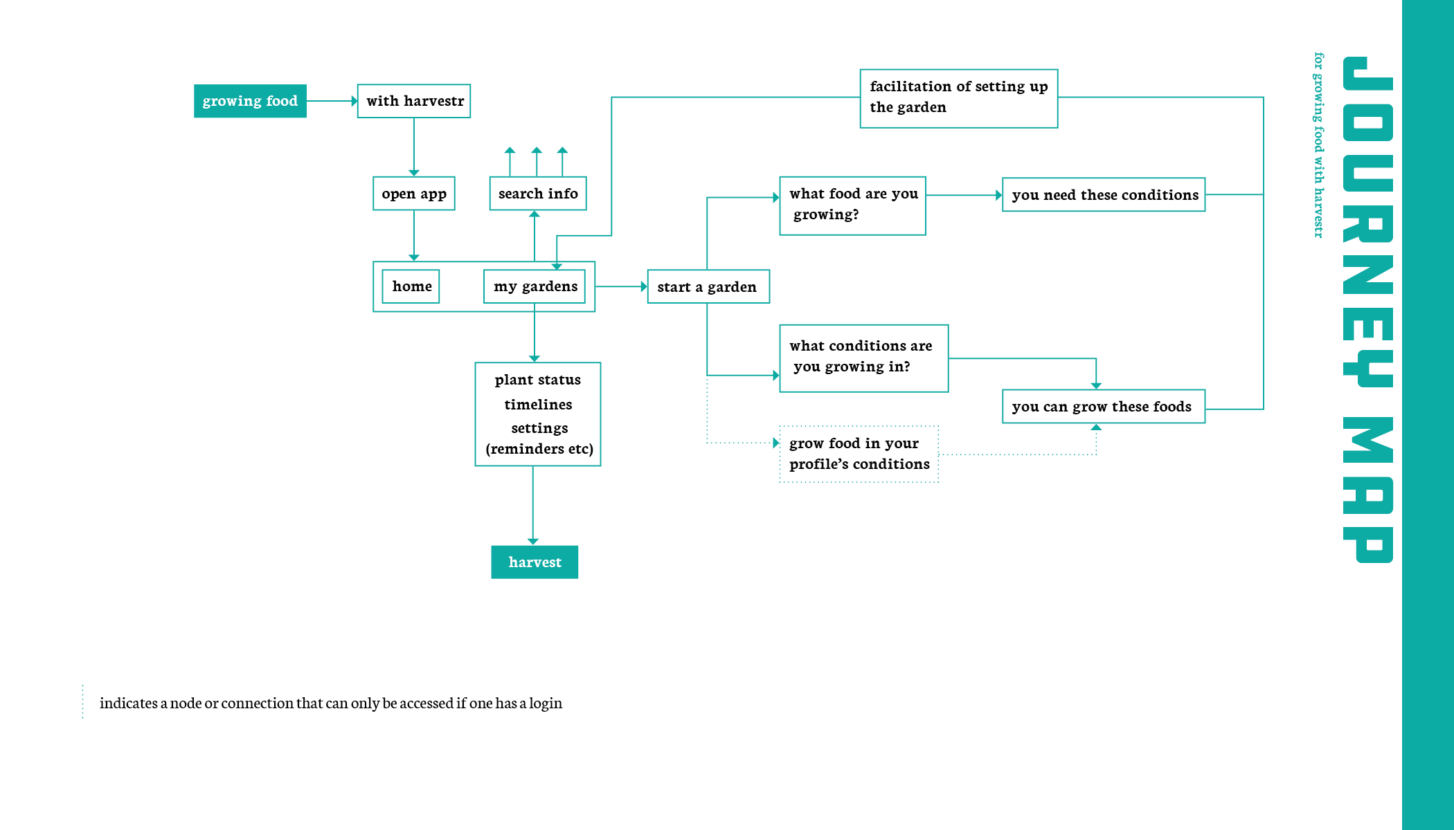
then we developed a journey map of how our app would be used.
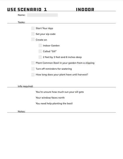
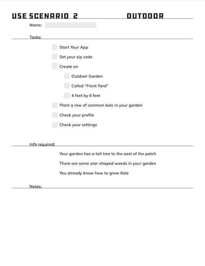
we then developed use scenario worksheets to base our prototype off of for user testing purposes:
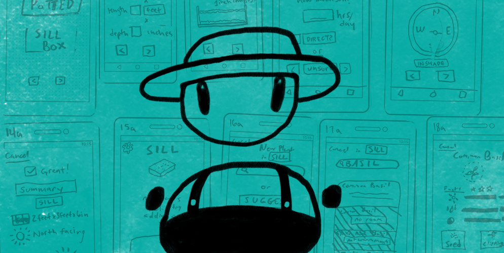
now, we could start on our paper prototype. so we began drawing...
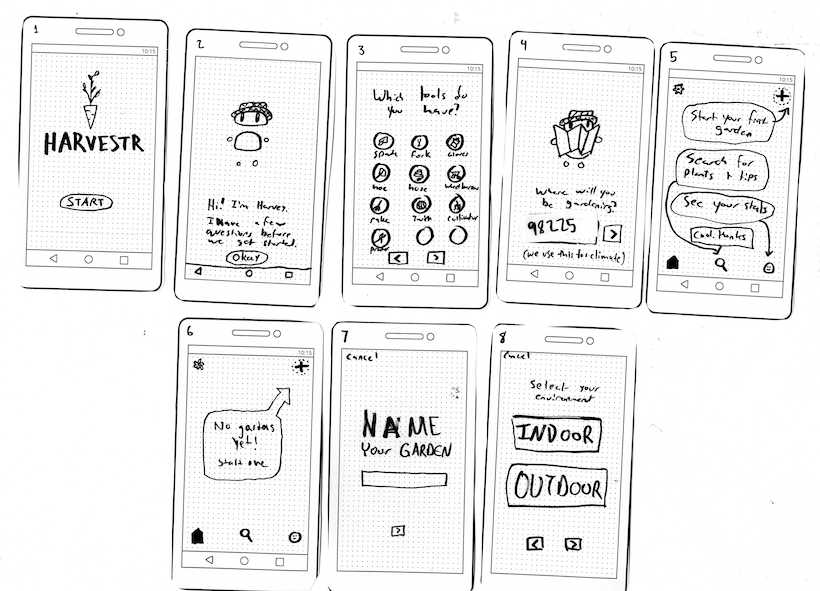
and drawing...
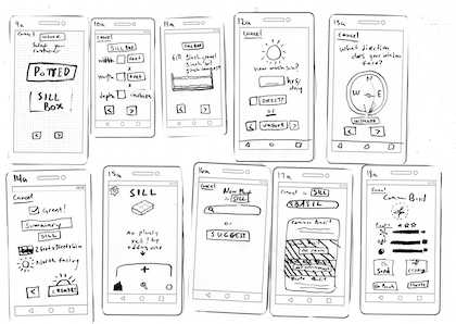
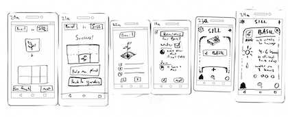
and drawing...
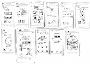
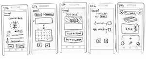
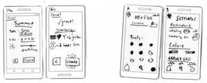
by the time we finished the two user scenarios we had come up with, we already had over forty screens. it was at this point that we decided to remove the community aspect of the app for simplicity's sake. (and for our own sanity)
This modified our journey map slightly and simplified our process. Overall, it was the right decision.
we then did user testing on 5 subjects with our paper prototype of the app.
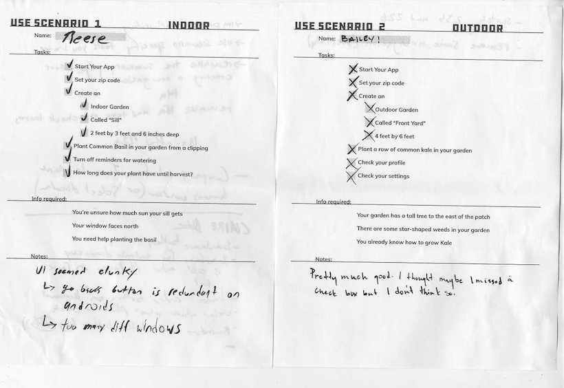
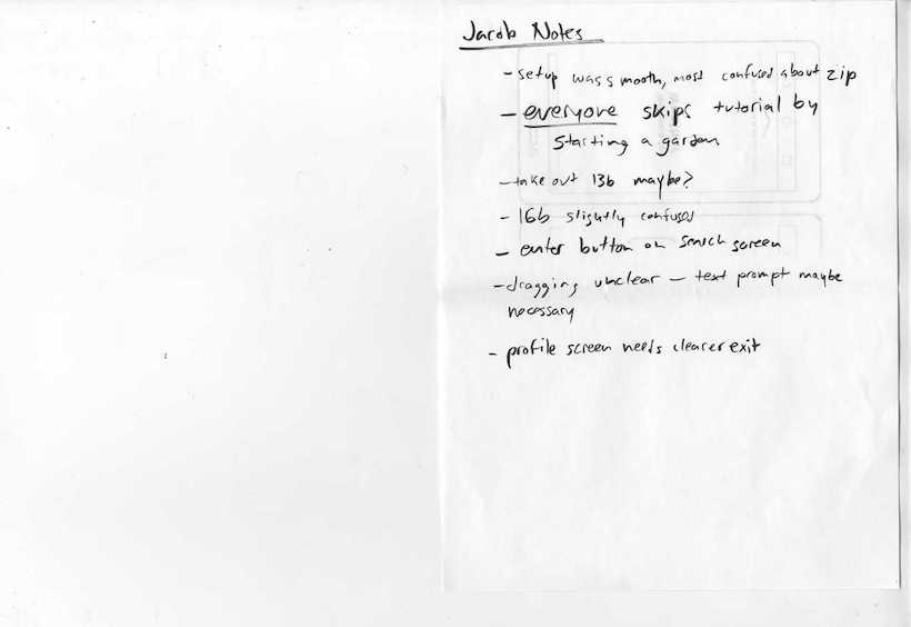
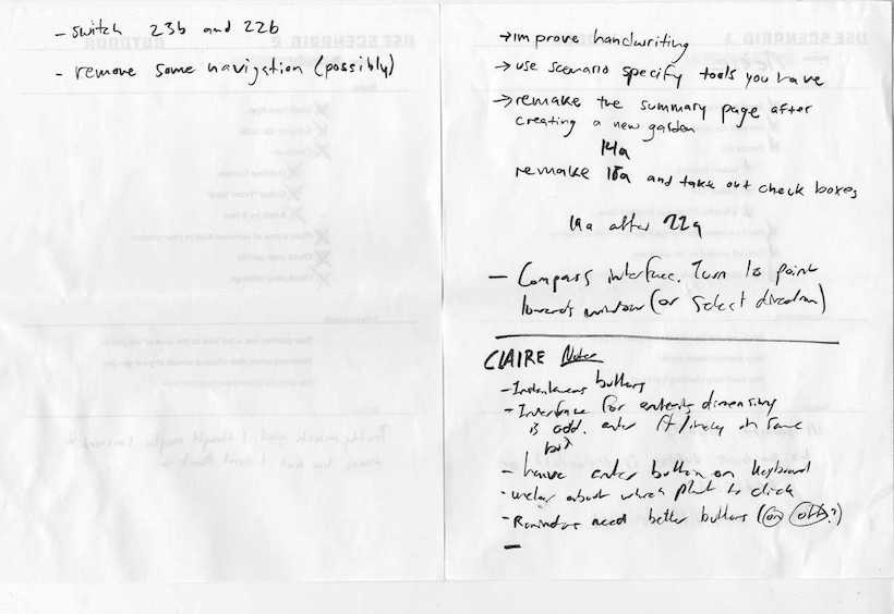
We got great feedback from our users and by the fifth test, most of the issues people were running into were inherent problems with paper prototypes: no response to selecting options, no motion, etc. The next step was visual design and a high-resolution prototype.
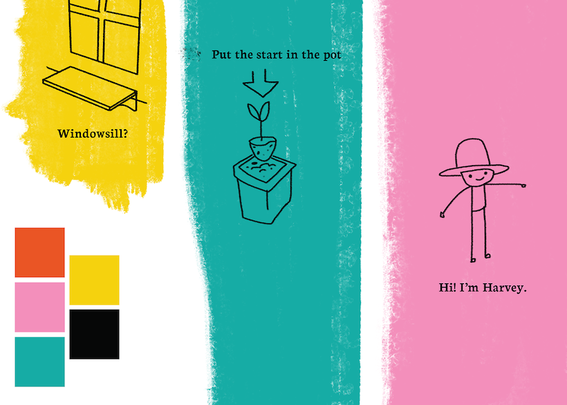
we had previously come up with rough concepts for our visuals, but refined them at this point in the process.
we wanted something functional yet inviting, so the hand drawn aesthetic with paint textures matched with the industrial type stood out the most to us.
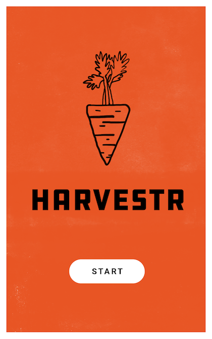
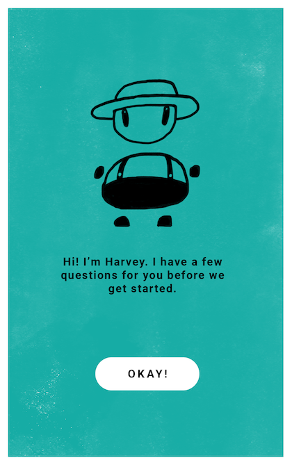
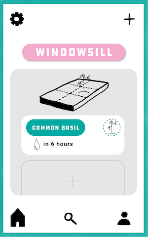
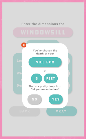
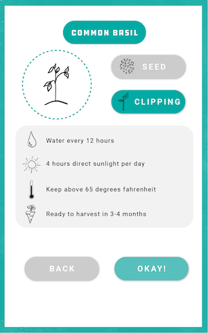
using this style, we laid out the ~40 different pages necessary for the high resolution prototype.
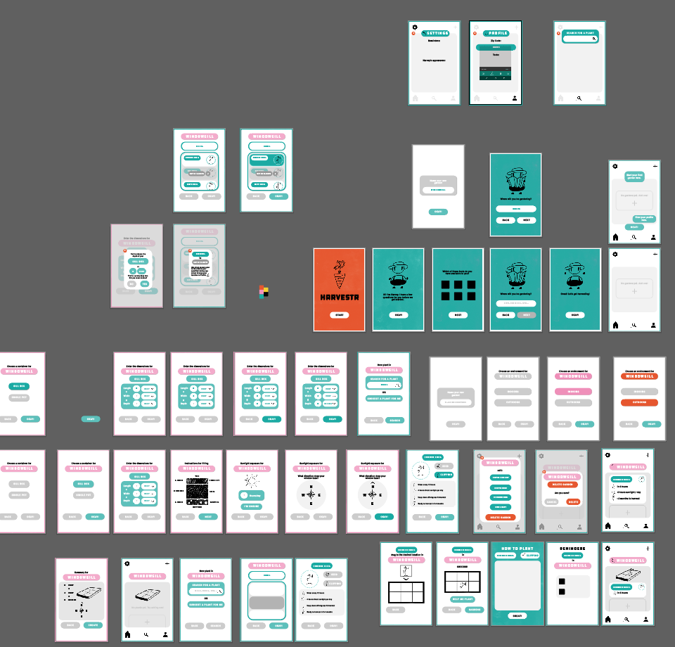
Using Invision, we implemented a functional high resolution prototype accessible online. You can access it here!
in reflection:
There are many things we could have done differently with this project. However, overall I think we made the correct decisions for simplification of functionality and usability. The app is something that, if built out, could be a very enjoyable and functional experience for the budding gardener.
NEXT PROJECT